PinkWallet is a mobile crypto wallet built for people who want to use crypto without becoming traders first. Everyday wallet actions, financial education and an AI assistant in one product.

[ Brief ]
Simple enough for people who are scared of crypto
Most crypto wallets are built for people who already understand crypto. Technical language, long wallet addresses, trader dashboards, and actions that cannot be undone.
PinkWallet was for a different audience: people who want the benefits of crypto without the vocabulary. A product area where a single mistake means someone's money is gone permanently.
[ Inputs ]

No research budget. Decisions still had to come from somewhere.
We had no access to user interviews, so every product decision needed another source of evidence.
01
Competitor audit
Where existing wallets lose people: address entry, moment before confirming.
02
App store reviews
The same complaints repeated across every wallet we looked at.
03
Borrowed conventions
Contacts from messaging. The review step from banking.
[ Architecture ]
Five areas, one product
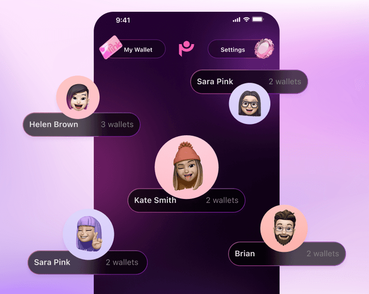
Before visual design, we built the product architecture: navigation, wallet logic, and how features connect.
Transactions, portfolio, education and support were not separate tools. They were parts of one experience.




[ Decisions ]
One feature, two parts, each designed around a specific insight from research.
Familiar actions, visible risk
The obvious path was a one-tap confirmation, consistent with the rest of the flow. I went the other way on purpose.
Everywhere else, friction is the enemy. At the moment of sending, it is the safeguard. A wrong address, network or amount cannot be undone, so one extra step is worth it.
Competitor wallets hid risk or buried it in jargon. App Store reviews repeated the same failures: wrong network, address, amount. So the final step became the last moment to catch an error, not a formality. Good UX is not always fewer clicks.

An assistant that acts
without taking control
without taking control
The cheaper path was no AI: onboarding, tooltips, an FAQ. But the problem was not finding the button, it was the constant decisions crypto forces: networks, fees, addresses, risk. So PIG helps at the moment of the decision, not once at the start where guidance gets ignored.
It is a co-pilot, not autopilot. PIG can prepare a transaction, fill the details and explain what happens next, but the final tap stays with the person. Sending is irreversible, so this is human-in-the-loop by design: less cognitive load, without giving up control.

[ What we cut ]
Two designers, eight weeks. Saying no was most of the job.
We ranked everything against one question: does this reduce the chance someone loses money or gives up?
[ System ]
One product, two moods
PinkWallet started with a soft pink identity. As the product grew, the system expanded into light and dark themes.
Same structure, same components, same interaction patterns. The interface changes mood without changing how it works.
200+ screens, states and theme variations across the product.
Both themes were built against WCAG AA contrast, with states carried by shape and label as well as colour, so nothing critical depends on hue alone.

[ Gallery ]
The complete experience

[ Reflection ]
Built on convention, never tested
Everything here rests on convention and on reducing the cost of a mistake. That was the right call for eight weeks, but it is still an assumption.
I would test the confirmation step first. We designed it to slow people down on purpose, and I do not know whether that reads as safety or as friction. That is a one-week study and we did not have the week.
I would also want to know whether people trust PIG more or less after it prepares a transaction correctly the first time. The whole AI model rests on that, and we never checked.
Crypto should not require people to think like traders before they can participate.


