Analytics was the ask. A reason to come back was the need
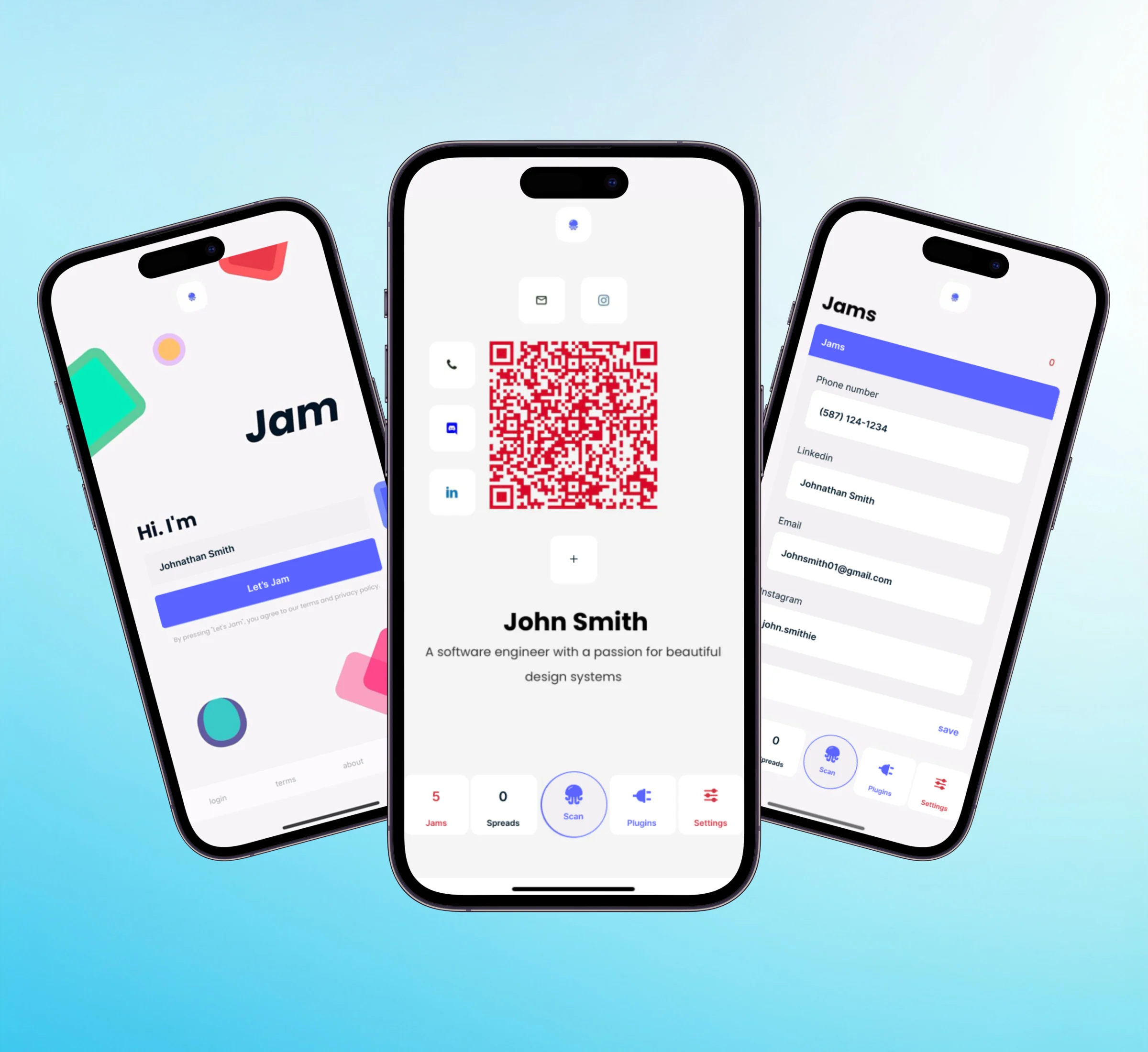
Jam Social is an existing networking app: scan a QR code, share your contact. The team asked whether to add analytics, and what kind would matter. I owned the research and the analytics feature.
Networking feels like talking into a void
“I shared my card with 20 people. Did anyone actually look at it?”
No signal after the scan
LinkedIn isn’t enough
No reason to reopen the app
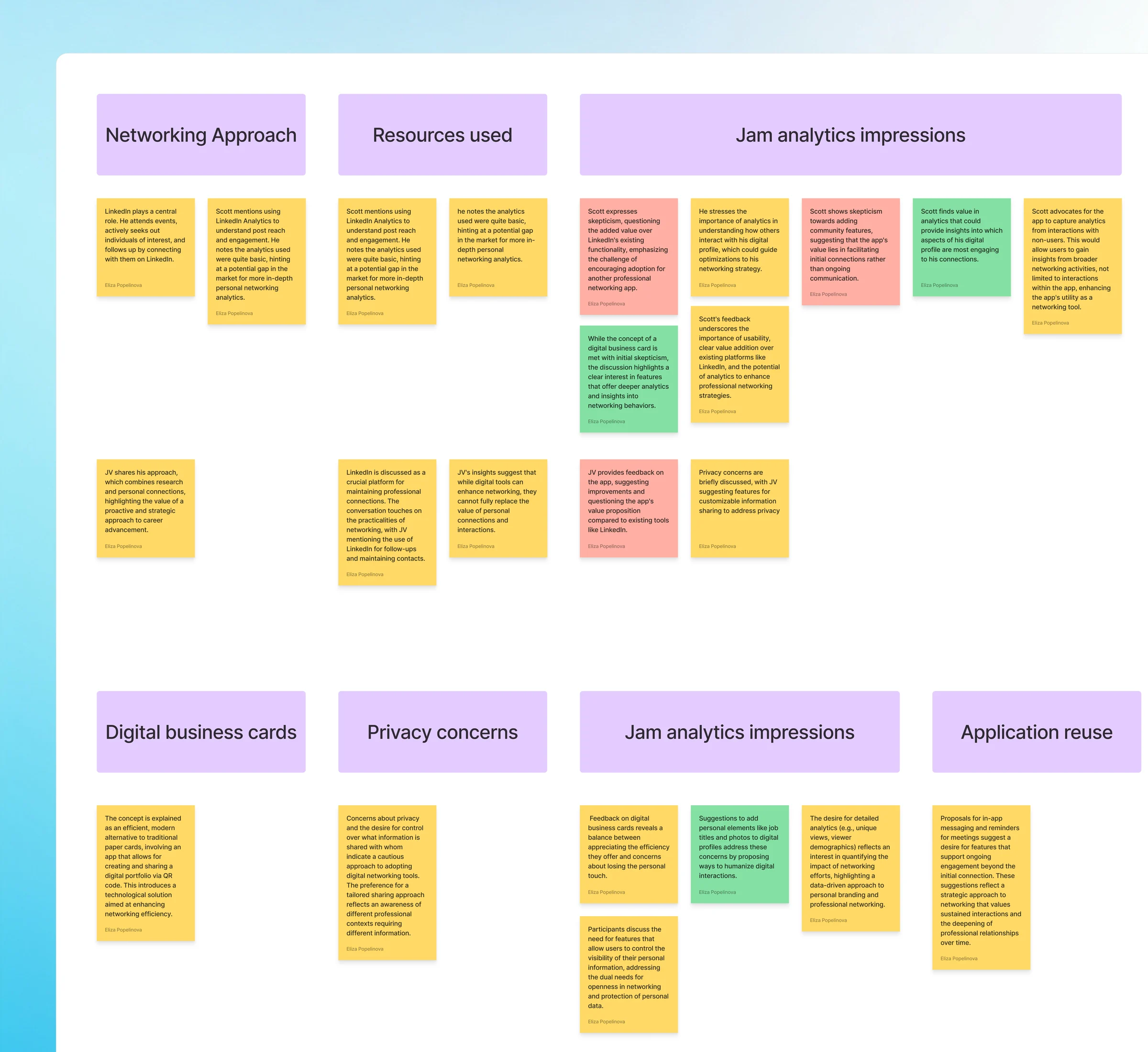
What people said, not what we assumed
Analytics should reach beyond the app.
Privacy is essential.
Control over who sees what came up unprompted in 7 of 10 interviews.
Without a reason to return, Jam Social is a one-time tool.
10+ interviews, one focus group, a competitor audit and a heuristic evaluation.
People didn’t want numbers. They wanted a reason to come back
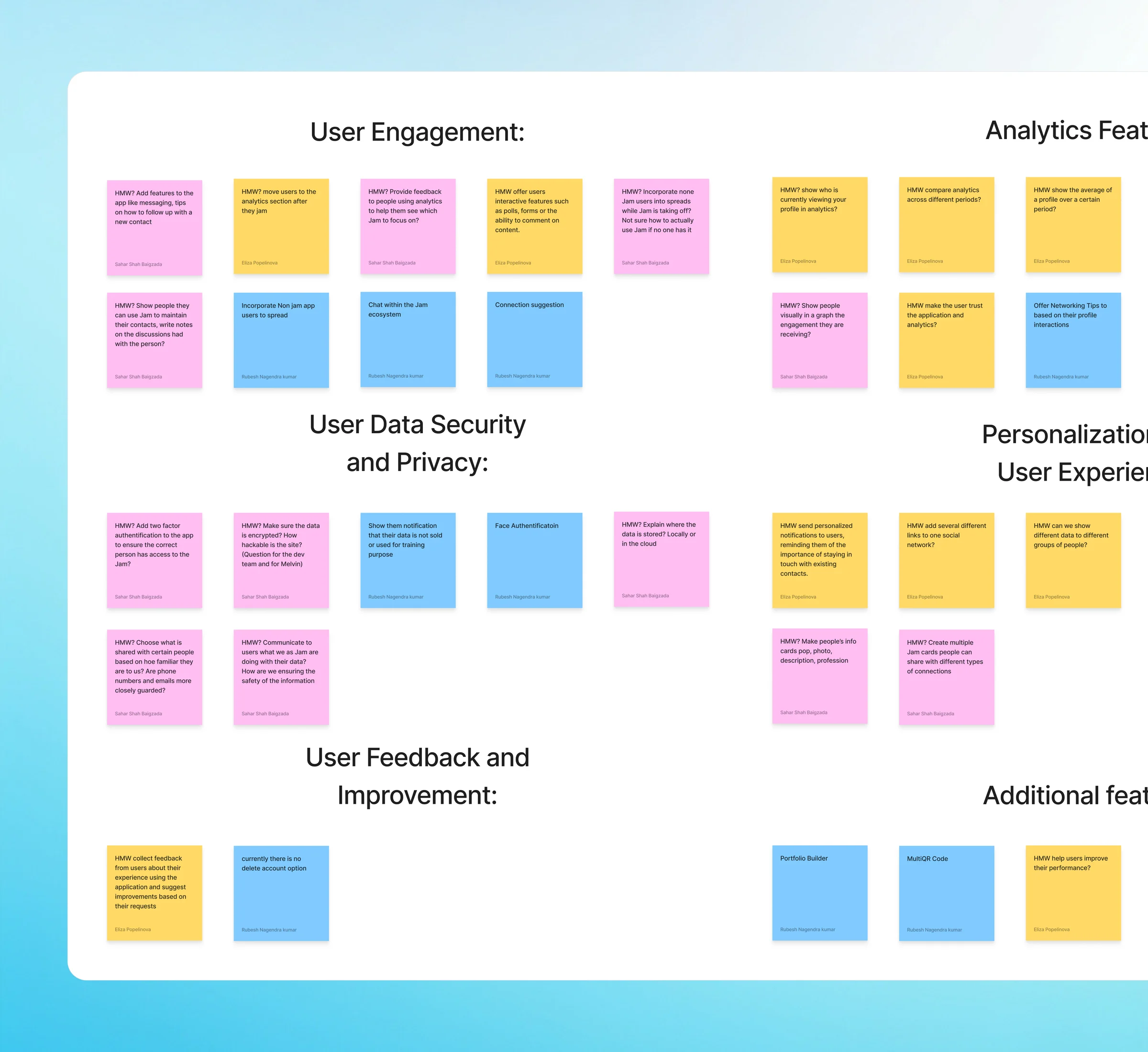
Two PMs, two definitions of analytics
A workshop turned them into one definition and three questions.
- How might we
Make analytics actionable, not just informational?
- How might we
Give people a reason to return between events?
- How might we
Surface insights without compromising privacy?
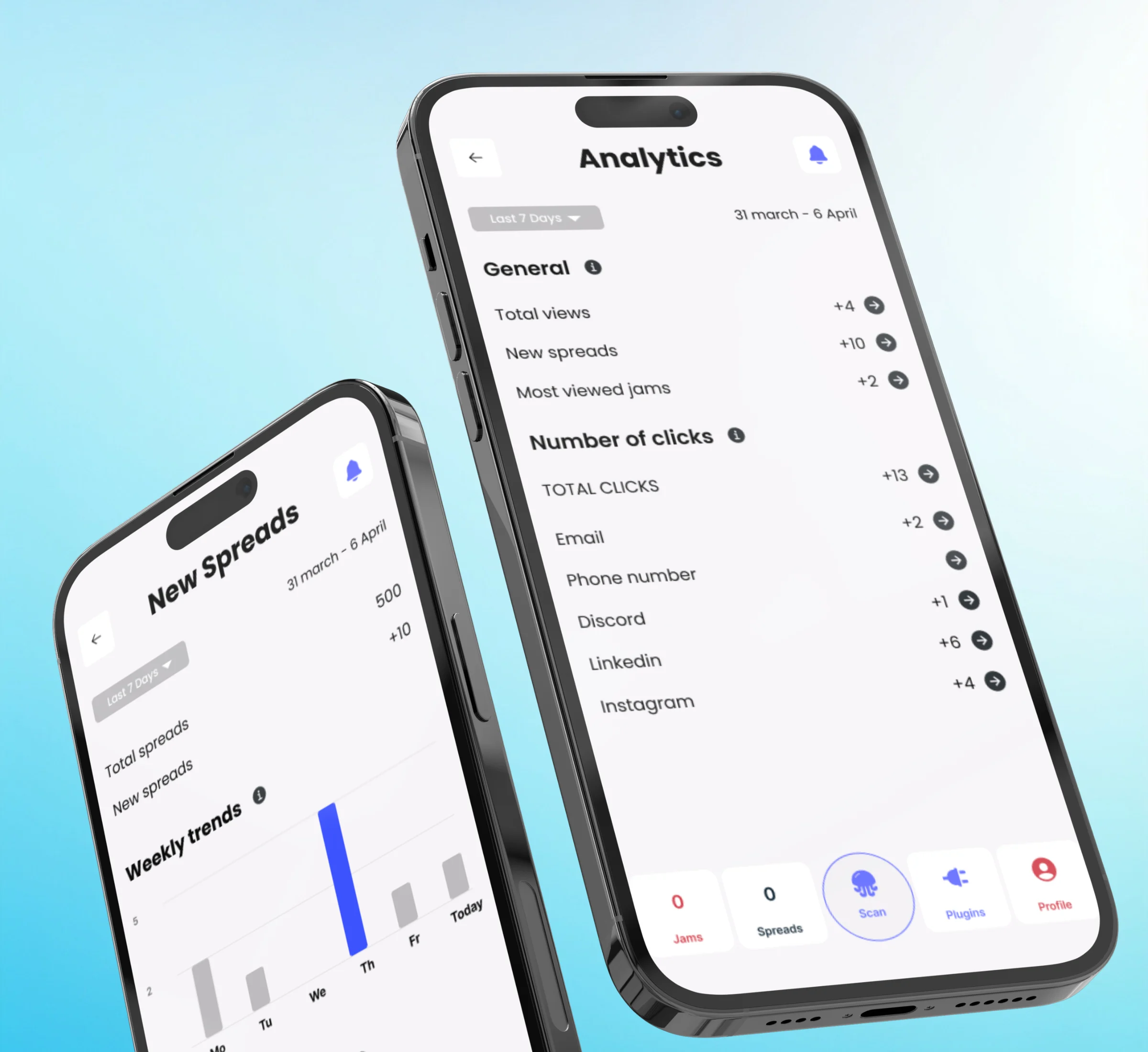
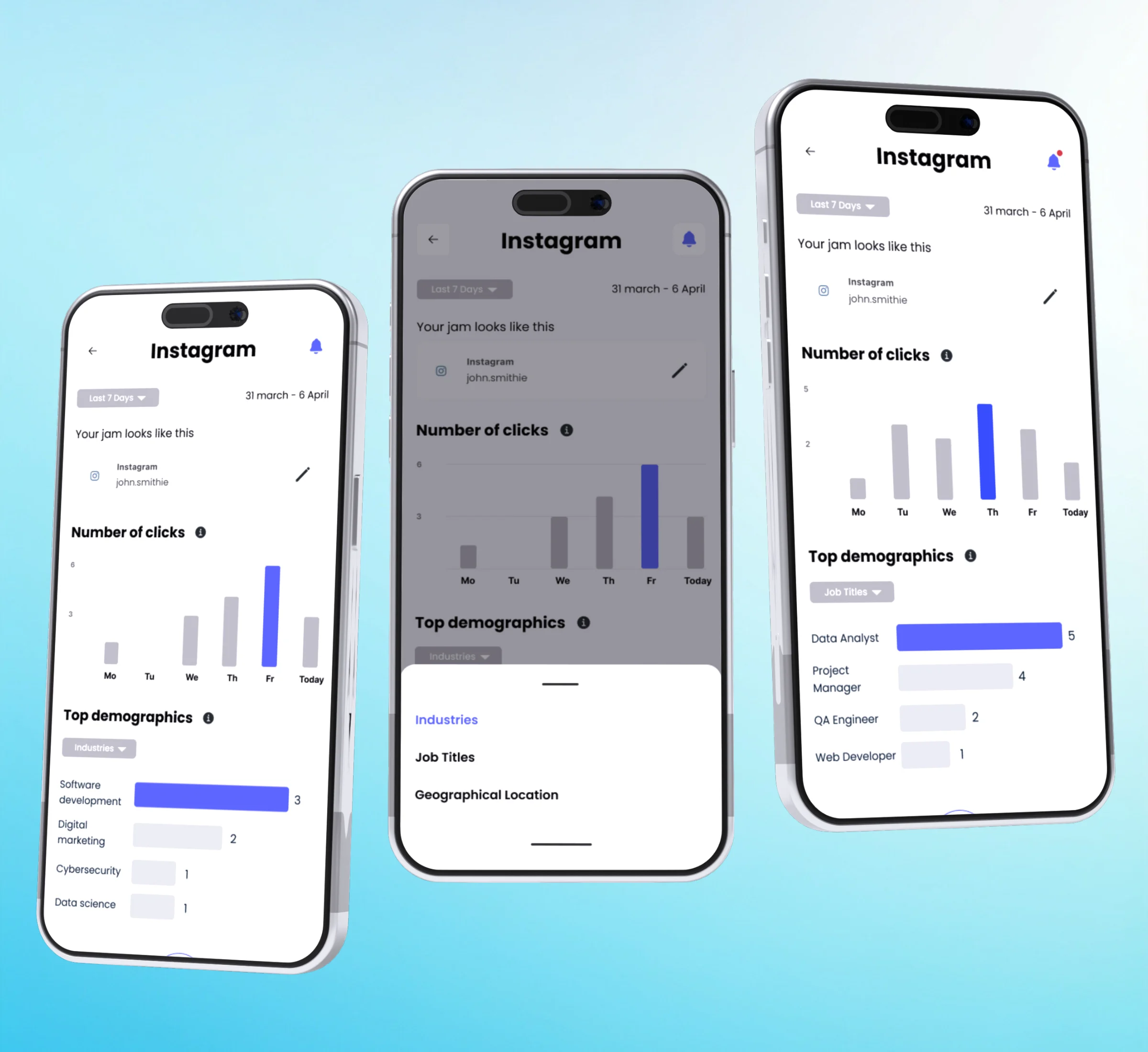
Analytics you can skim
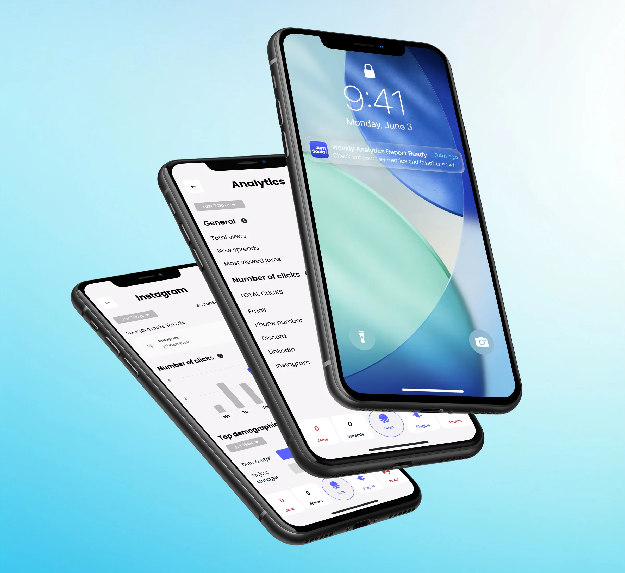
A dashboard and a weekly digest, built for a glance between events.
Clicks per Jam
By day
Top job titles
Who opens your Jams
Weekly digest
Arrives as a notification
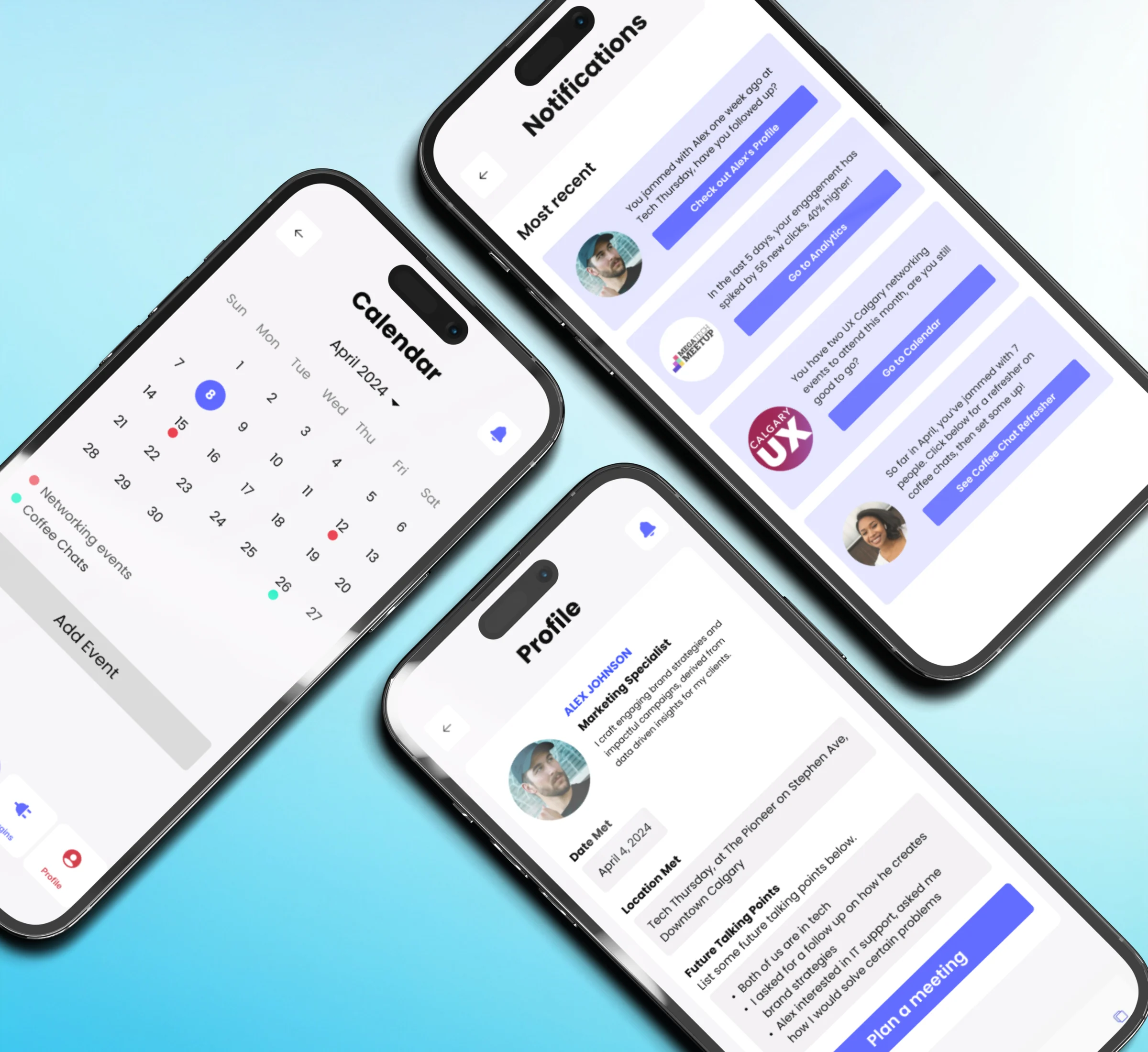
Analytics says who. Reminders say when
Each connection gets a profile with event history, talking points and notes.
-
Follow-up reminders
Tied to a person and an event
-
Engagement updates
When your clicks go up
-
Event suggestions
Networking events worth attending
-
Coffee chat refreshers
A reminder before you meet
8 usability tests, 3 changes
| What we saw | What changed |
|---|---|
| Icon-only navigation confused 5 of 8 testers | Text labels on the bottom navigation |
| Clarity was rated 2 | Dividers and colour: rated 4.5 |
| Contact details came before context | Event context first, then the person |
The brief is rarely the real problem
Aligning two PMs took as much work as the screens.
We tested with people who network easily, not with those who find it hard.
- Validate with shipped data
- Test notification fatigue
- Prime users for analytics in onboarding
Let’s make complex products easier to understand and trust
From fintech to AI-powered experiences, I turn complex ideas into products people feel confident using.